Tycoon and Simulator Game Icon Patterns That Signal Genre at a Glance
Money, crowds, and overhead views stack together to signal tycoon and simulator games at a glance.
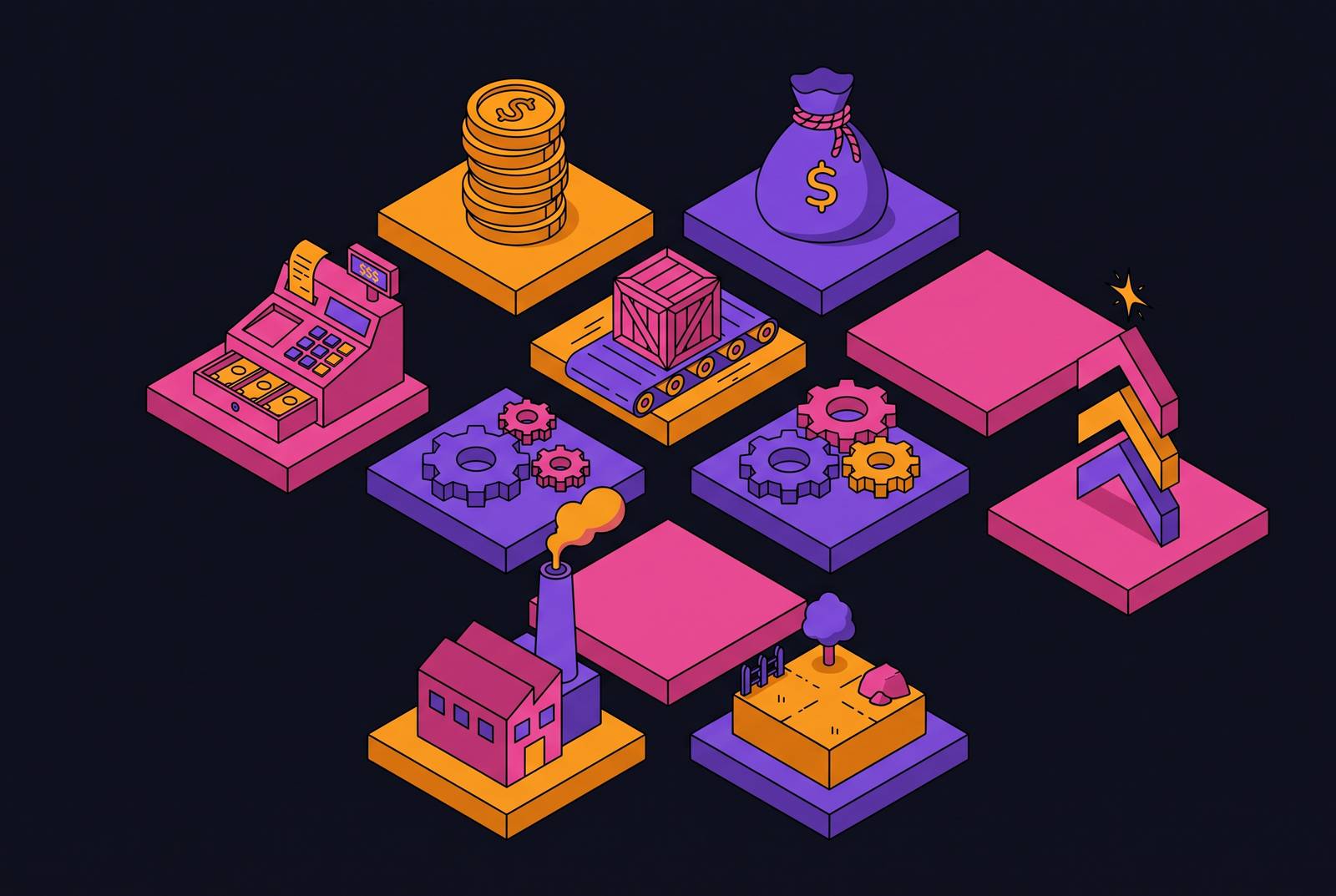
Tycoon and simulator games have a genre-signaling problem most other genres don't have: there's no single image that says "tycoon" the way a car says "racing game." This piece is about why that gap exists and what creators actually do to close it.
Tycoon and simulator icons and the genre-signaling problem
Racing games show a car. Horror games go dark and drippy. If a player scrolls the app store, they see the shape and know the genre before their thumb even stops moving. That's the whole trick: one stable archetype doing all the work.
Tycoon and simulator games don't get that shortcut. The genre covers cafés, prisons, zoos, theme parks, dinosaur parks, aquariums, hospitals, factories, criminal empires, space colonies, and railway networks. A prison and an aquarium share a label, but they share almost nothing visually. There's no object you can point a camera at and say "that one thing means tycoon."
App store browsing happens in under a second. A player who already loves this genre needs to recognize it on sight, before reading a word of the title or description. That recognition has to live in the icon itself.
The obvious pushback: most of these games just put the genre in the name. "Tycoon." "Simulator." Right there in the title. But title text is unreadable at icon size, a tiny smear of pixels nobody's squinting at mid-scroll. The image has to do the job the words can't.
Tycoon and simulator are not one genre
The label "tycoon and simulator" is really several different genres wearing a trench coat. Idle and hybrid-idle games like Idle Supermarket Tycoon, Idle Hotel Empire Tycoon, and Idle Zoo Tycoon run on passive income and offline earnings, but they still ask for tapping, hiring, and real-time decisions along the way. That's a blended loop: part autopilot, part active input.
Active management games like Gas Station Simulator, Supermarket Manager, and Hotel Manager Simulator make a different promise. No offline earnings ticking up while you sleep. Just constant input, constant decisions, hands on the wheel the whole time.
The line between "tycoon" and "simulator" gets blurry fast, too. A mechanic simulator that also lets you expand the shop and hire staff is both genres at once. An icon that signals only one half of that risks pulling in the wrong player, and that player churns the moment the game doesn't match what the icon promised. Management simulation alone stretches across healthcare, food service, café management, transportation, farming, and colony building, each with its own visual world. There's no single formula that covers all of it: it isn't a single genre pretending to be many, but many genres sharing one shelf tag.
Visual cues that read as "tycoon" or "simulator" at a glance
A handful of visual elements have become the working vocabulary for this genre, and they earn that status because each one compresses a whole gameplay loop into a single glance.
Money piles, stacked coins, currency signs, buildings that visibly expand: these say "financial growth is the point" faster than any sentence could.
An isometric or top-down overhead view does something sneakier. It turns a space into a system you can control. That camera angle alone tells a player: you're not a character here, you're the manager.
Progress bars, upgrade arrows, conveyor belts, assembly lines: these signal the climb, the sense that something is always leveling up, which is the heartbeat of both idle games and factory games.
Crowds matter too. A handful of small figures (customers, guests, staff) moving through a space says "this is a managed system," not a solo adventure.
And then there's the face. Think of a smiling CEO type, or a manager sweating through a bad shift. A face reads faster than any object on the screen. Expression tells you there's a person steering this, and that person is stressed, satisfied, or scrambling, which is basically the entire emotional pitch of the genre in one glance.
How setting determines genre codes in the icon
None of those cues work the same way twice. Which one does the heaviest lifting depends entirely on the setting, because the setting changes what "the loop" actually looks like.
Take animal and nature management: zoos, dinosaur parks, aquariums. The animal is the obvious loop element. But a single animal on its own risks reading as an animal game, full stop, not a management game. Pairing that animal with an enclosure fence, a crowd of visitors, or an overhead park layout makes it read as a system someone's running, not a creature someone's petting. Zoo management titles like Idle Zoo Tycoon and aquarium titles like Megaquarium make that same move.
Hospitality and retail settings work differently. A queue of customers at a register, or guests checking into a hotel lobby, carries the loop on its own: satisfaction in, expansion out. But scale changes the picture. Restaurant Empire 2 spans four cities (Paris, Rome, Munich, and LA), and a multi-city culinary empire calls for a different icon approach than a single-restaurant idle game, even though both wear the "restaurant" label.
Industrial and factory settings (mining, airplane manufacturing, train networks) lean on assembly progression and conveyor imagery, because that signals a production chain, not a single transaction. An idle train empire with route customization is still, visually, about movement and expansion along a line.
Then there are the settings where the "building" itself isn't obviously a business at all: Prison Architect, Two Point Hospital, Game Dev Tycoon, Idle Magic Academy Tycoon. Nobody's first instinct is to picture a prison as a managed enterprise. Here, the manager character or the overhead facility view has to carry more of the signal than the setting itself can. An icon can hint at Prison Architect's moral-decision layer and Two Point Hospital's humor register through expression and color palette alone, with no architecture required, because those are genre differentiators.
Political and economic strategy settings add a different complication. Tropico 6, Anno 1800, Offworld Trading Company, Empire of Sin all blend city-building, economic simulation, and sometimes combat. The icon has to pick one loop to lead with, because trying to signal all three at once just creates noise. Getting that choice wrong carries a specific risk: an icon for Anno 1800 that leads with naval combat, or one for Empire of Sin that leads with criminal conflict, can read as an action game instead of a tycoon game, even though combat is secondary to the actual management loop underneath.
Layering two or three cues outperforms any single symbol
No single cue is specific enough to do the job alone. A pile of money could belong to a slot game, a casual puzzle, or a tycoon game. An isometric overhead view could just as easily belong to a city-builder, an RPG, or a straight strategy game. Neither symbol is exclusive to this genre.
Combining them, though, removes the ambiguity. An isometric view, plus a crowd of small figures, plus a wealth symbol or a progress bar: no other genre stacks all three of those together. That combination is what closes the gap between "could be anything" and "unmistakably build-and-manage."
The face adds another layer on top. A manager character standing in front of an isometric scene says "you're in charge of this system," merging a human emotional cue (stress, satisfaction, pride) with the structural cue of the view behind them.
Color does quiet work here too. The field convention of sticking to 2 or 3 dominant colors isn't just about looking clean. It lets palette carry one layer of meaning (mood, sub-genre, tone) while composition carries a separate layer (the isometric view, the sense of control). Two signals, two channels, no collision.
None of this means piling on detail. It means choosing two or three elements that all point the same direction, and trusting that the combination does more work than any single symbol ever could on its own.
Where icon genre-signaling breaks down
The failures here aren't random. They follow directly from misapplying the exact principles above, and they fall into two camps.
The first is signaling the wrong genre. An icon that leads with a dramatic action beat (combat, a chase, a flying ship) reads as action or adventure, even if the actual game underneath is a management sim with the occasional skirmish. Anno 1800 and Empire of Sin both sit in exactly this danger zone: naval combat and criminal conflict are secondary systems in the actual game, yet if either one dominates the icon, the player arrives expecting a different game than the one they downloaded.
The second failure is subtler: the icon signals the right genre but lies about the first minute. If an icon shows a fully built-out zoo, a sprawling shopping center, or a finished factory floor, it promises a state the player won't reach for hours. The first actual minute of play is usually an empty field waiting to be built. That gap between promise and reality is what drives a quick uninstall.
Sub-genre confusion creates a related mismatch. Passive-loop imagery (coins falling on their own, an auto-builder humming away) tells a player to expect idle mechanics. But if the actual game demands constant taps, hires, and real-time decisions, that player downloaded the wrong expectation, and they leave fast. This mismatch has only gotten more common as the genre shifted toward hybrid active-participation models: icons built around pure idle logic now mislead players looking at a newer generation of games that ask for far more hands-on attention.
The same root mistake produces both failure modes: copying what a successful icon looks like instead of understanding why it worked. Visual imitation without the underlying clarity just produces a different kind of confusion, dressed up to look like a winning formula.
How the brand-escape argument changes the calculus
There's a real objection to all of this, and it deserves a straight answer rather than a dismissal: once a game is big enough, does any of this genre-signaling even matter?
At sufficient scale, players tap an icon because they recognize the game, not because they're decoding its genre from a picture. Recognition replaces comprehension. A character who's become the brand can carry an icon on name recognition alone, because the audience already knows what they're getting and needs no genre cues.
That's a real dynamic, and it works. But it only works after a game has already built an audience large enough to recognize. Almost every tycoon or simulator launch starts from zero, with no existing fan base and no brand recognition to lean on. Those launches need to recruit players who've never heard of the game, and those players have nothing to go on but the image in front of them.
So genre clarity isn't a nice-to-have for small or early-stage creators: it's the thing that gets a game to the scale where brand-escape even becomes possible. That makes launch and early growth the exact moment genre-clear design matters most, which is also, frustratingly, the exact moment creators are most tempted to skip it in favor of showing off the game's flashiest, most spectacular state.
AI icon tools now give creators without design training new capabilities
The barrier that used to excuse a weak icon has mostly disappeared. By 2026, AI icon generators can produce professional icon sets in minutes, not hours. That changes the calculation: a bad icon used to be a reasonable tradeoff for a solo creator or small team without design budget. It's a much harder argument to make now that the cost of doing it well has dropped this far.
Tools built with an understanding of game design conventions can apply genre-appropriate visual composition, color choices, and layout on their own, so they encode the exact principles this piece has walked through. Small studios and solo creators can generate characters, props, environments, and icons that share one consistent look, which solves the style-consistency problem that trips up beginners more than almost anything else.
The people who benefit most are the wave of no-code and low-code creators shipping games faster than ever, often without any formal design background. A creator using a platform like studs.gg to build a tycoon or simulator game can now apply the same genre-signal thinking that established publishers rely on: describe the core loop, describe the setting, describe the emotional register wanted, and let the tool handle the composition.
A practical framework for choosing genre cues before opening any design tool
Before you open any design software, three questions can settle most of the decisions above.
What's the core loop? Idle accumulation should lead with a wealth symbol or a progress bar, because passive growth is the promise being made. Active management should lead with a crowd-and-flow composition or a stressed manager character, because real-time decisions are the promise instead. Factory and assembly games should lead with conveyor belts or production-chain visuals, because systemic growth is the point. Hybrid games should pick whichever element is more active, because that sets more accurate expectations and cuts down on churn from players expecting something passive.
What does the setting's first recognizable element actually look like, and does it read as a system or just a place? A zoo, a hospital, a space colony: on their own, these just read as locations. An overhead view or a crowd of figures reframes them into something under management. For unconventional settings like a prison or a magic academy, the manager character or the facility view has to do more of that reframing than the setting itself ever will.
What's the emotional register of the first minute, satisfaction, stress, humor, or scale? Humor, as in Two Point Hospital or Let's Build a Zoo, rides on character expression and bright color. Scale and ambition, as in Anno 1800 or Offworld Trading Company, rides on isometric breadth and cool blues that suggest strategic depth. Accessible and casual, as in Idle Supermarket Tycoon or Gas Station Simulator, rides on warm saturated color and a simple focal point that says "easy to pick up."
From there, the layering rule holds: pick two or three elements that all point the same direction. Anything past three collapses into noise at icon size, so the limit isn't a creative constraint, it's just physics. And before calling the icon finished, check it against the overpromise trap: does it show a state the player can actually reach in a normal play session, or does it show the finished empire the game will take ten hours to build?
The icon is the first promise the game makes to a player, before a single line of dialogue, before a single tutorial pops up, before the player has spent a cent or a minute. Get that promise right and the rest of the game gets a fair chance to be judged on its own merits.